UX/UI
User Research/Analysis, Interface Design, Prototyping, User Testing, Visual Identity
Tools Used: Figma, Zeplin, Miro, Illustrator, Photoshop
COFY
Case Study
User Research/Analysis, Interface Design, Prototyping, User Testing, Visual Identity
Tools Used: Figma, Zeplin, Miro, Illustrator, Photoshop

Challenge:
Cafe Curriculum
Udacity was seeking to create a digitally-enabled coffee shop experience for their online students. As part of this experience, students needed to be able to use an app to place drink orders, get motivated to advance through curriculum and facilitate a productive study environment. The Cofy app is designed to address these features.
Discovery:Research and Analysis
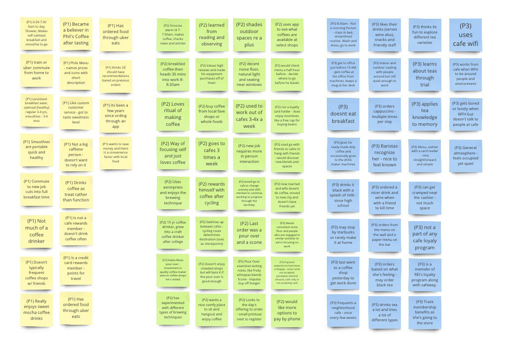
Upon outlining a research plan and getting stakeholder buy-in, I began gathering insight from the target audience by interviewing participants about their cafe experiences. Responses were grouped into common themes that essentially outlined delights, pain points and opportunities.
[Participant insights were recorded to cards]
Research and Analysis
Upon outlining a research plan and getting stakeholder buy-in, I began gathering insight from the target audience by interviewing participants about their cafe experiences. Responses were grouped into common themes that essentially outlined delights, pain points and opportunities.
[Participant insights were recorded to cards]
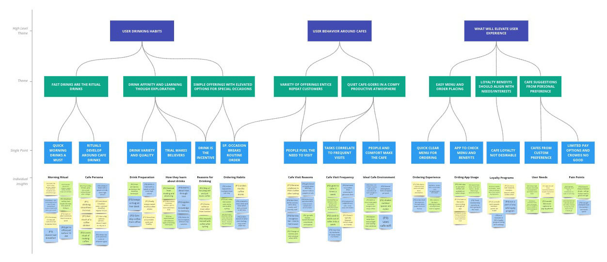
[Cards were sorted to group insights into common themes through affinity mapping]
The qualitative research from the remote interviews yielded valuable insight that aided in app feature ideation sessions.
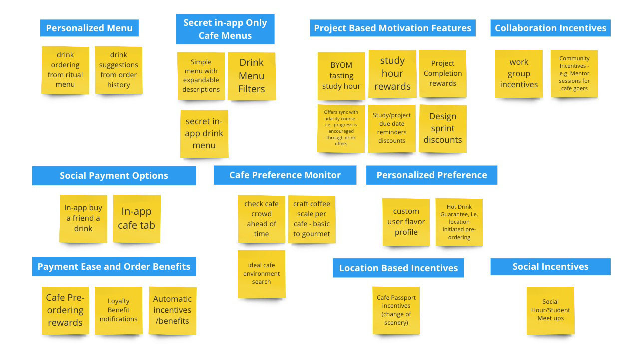
The features were then synthesized to identify potential opportunities and risks for the application design and development. Standout features included: Project Based Motivation, Cafe Preference Monitor, Payment Ease and Order Benefits, and a simple personalized menu.
The features were then synthesized to identify potential opportunities and risks for the application design and development. Standout features included: Project Based Motivation, Cafe Preference Monitor, Payment Ease and Order Benefits, and a simple personalized menu.
[Understanding gained from affinity mapping was used to ideas features]
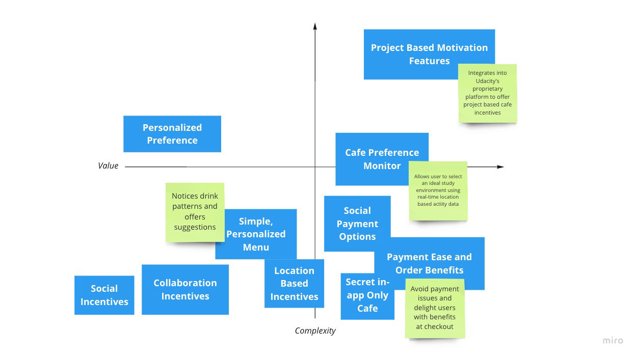
[Features were then mapped into the Value vs. Complexity quadrant to assess order of importance]

Design:
I began sketching rough concepts around the features of Project Based Motivation, Cafe Preference Monitor, Payment Ease and Order Benefits, and a simple personalized menu. I kept the sketches simple and rudimentary so as not to get bogged down with anything beyond the feature I was designing for.
Concepts & Sketching
I began sketching rough concepts around the features of Project Based Motivation, Cafe Preference Monitor, Payment Ease and Order Benefits, and a simple personalized menu. I kept the sketches simple and rudimentary so as not to get bogged down with anything beyond the feature I was designing for.
[Rapid concept sketching employed the crazy-8’s ideation method to yield wireframes for consideration]

The most successful sketches were then developed further by creating wireframes and a clickable prototype. This bare-bones concept was then tested to gauge how intuitive the user flow was and to address any conversion hinderances.
[Low fidelity prototype first iteration with feature descriptions.]
[Low fidelity prototype first iteration with feature descriptions.]
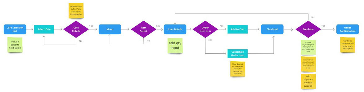
[Use case flow for drink ordering with notation derived from participant data outlines feature improvements]

Further iterations on the wireframe were designed to address feedback from user testing.
[Updated wireframe designs with iteration documentation]
Develop:
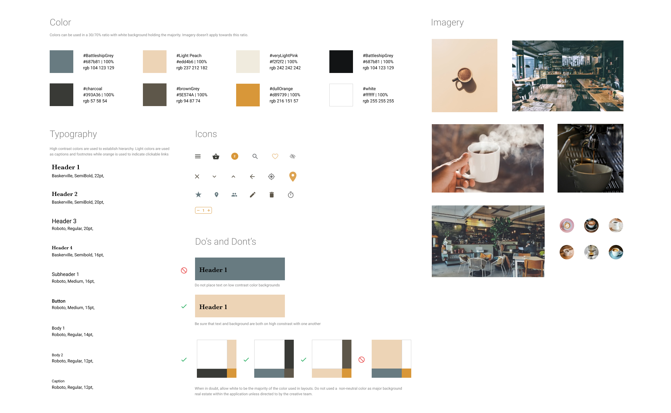
After the user flow ran smoothly I began designing the look and feel by creating a style-guide which defined typography, color palette and photography styles. I applied the style-guide to the first iteration of the prototype and ran an accessibility test on it and another round of usability testing.
[First style guide iteration used to design high fidelity prototypes]
Prototyping
After the user flow ran smoothly I began designing the look and feel by creating a style-guide which defined typography, color palette and photography styles. I applied the style-guide to the first iteration of the prototype and ran an accessibility test on it and another round of usability testing.
[First style guide iteration used to design high fidelity prototypes]

[This prototype can be found here:
https://www.figma.com/proto/8UgQ8ONTJsH6fN1czVxuMr/Udacity-Cafe-Design-Iteration-2?node-id=158%3A1625&scaling=min-zoom]

Test:
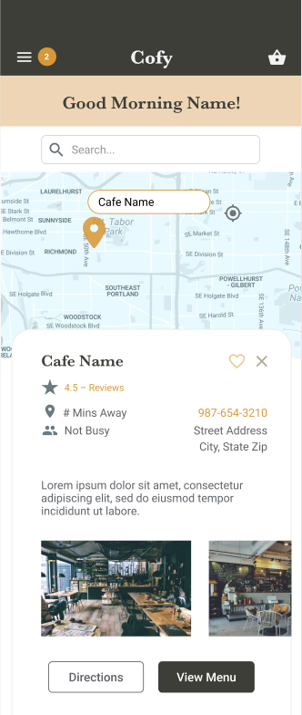
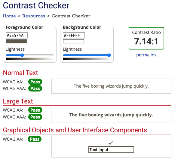
My prototype had some accessibility issues. There wasn’t enough contrast between the background color and foreground text didn’t have enough contrast.
[Before accessibility testing to measure contrast within the application’s elements]
Validation, Usabillity, Feedback
My prototype had some accessibility issues. There wasn’t enough contrast between the background color and foreground text didn’t have enough contrast.
[Before accessibility testing to measure contrast within the application’s elements]
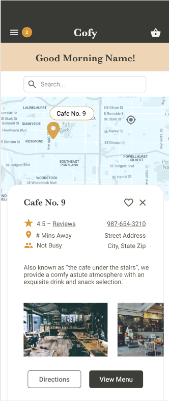
I adjusted the pallet colors pallet and icons to achieve a passing accessibility grade.
[After accessibility testing]
[After accessibility testing]
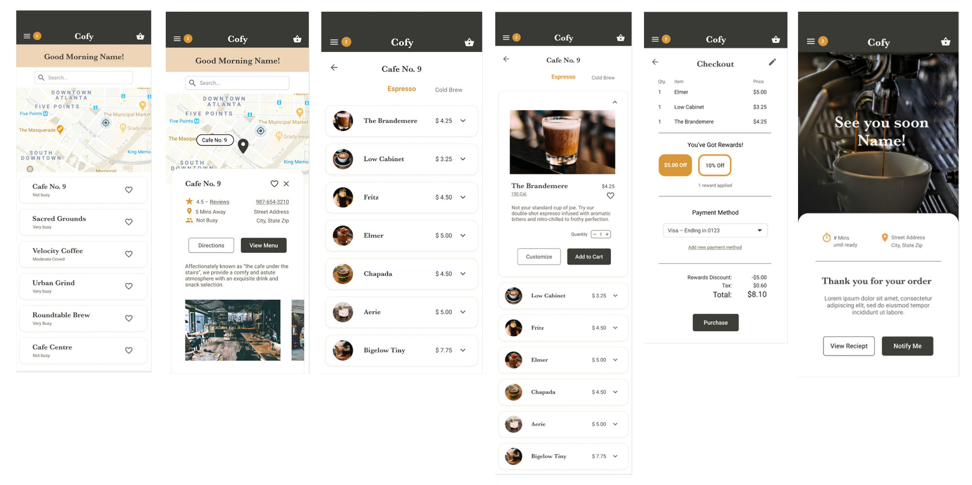
[Fourth and final iteration of the drink ordering use case]
Design:
In a second usability study accessing the drink ordering process I found that there was a 25% fail rate among users. This happened because the view menu button was not in plain view once the cafe select card was opened. Participants would tend to click all visible buttons when it was unclear how to proceed. The next design iteration was made to address the following:
KPI: Improve task success rate
Iteration: User Flow - Purchase a drink from a cafe
Hypothesis: Minimizing the need to scroll will improve the drink order completion success rate.
[Final prototype]
Iteration
In a second usability study accessing the drink ordering process I found that there was a 25% fail rate among users. This happened because the view menu button was not in plain view once the cafe select card was opened. Participants would tend to click all visible buttons when it was unclear how to proceed. The next design iteration was made to address the following:
KPI: Improve task success rate
Iteration: User Flow - Purchase a drink from a cafe
Hypothesis: Minimizing the need to scroll will improve the drink order completion success rate.
[Final prototype]
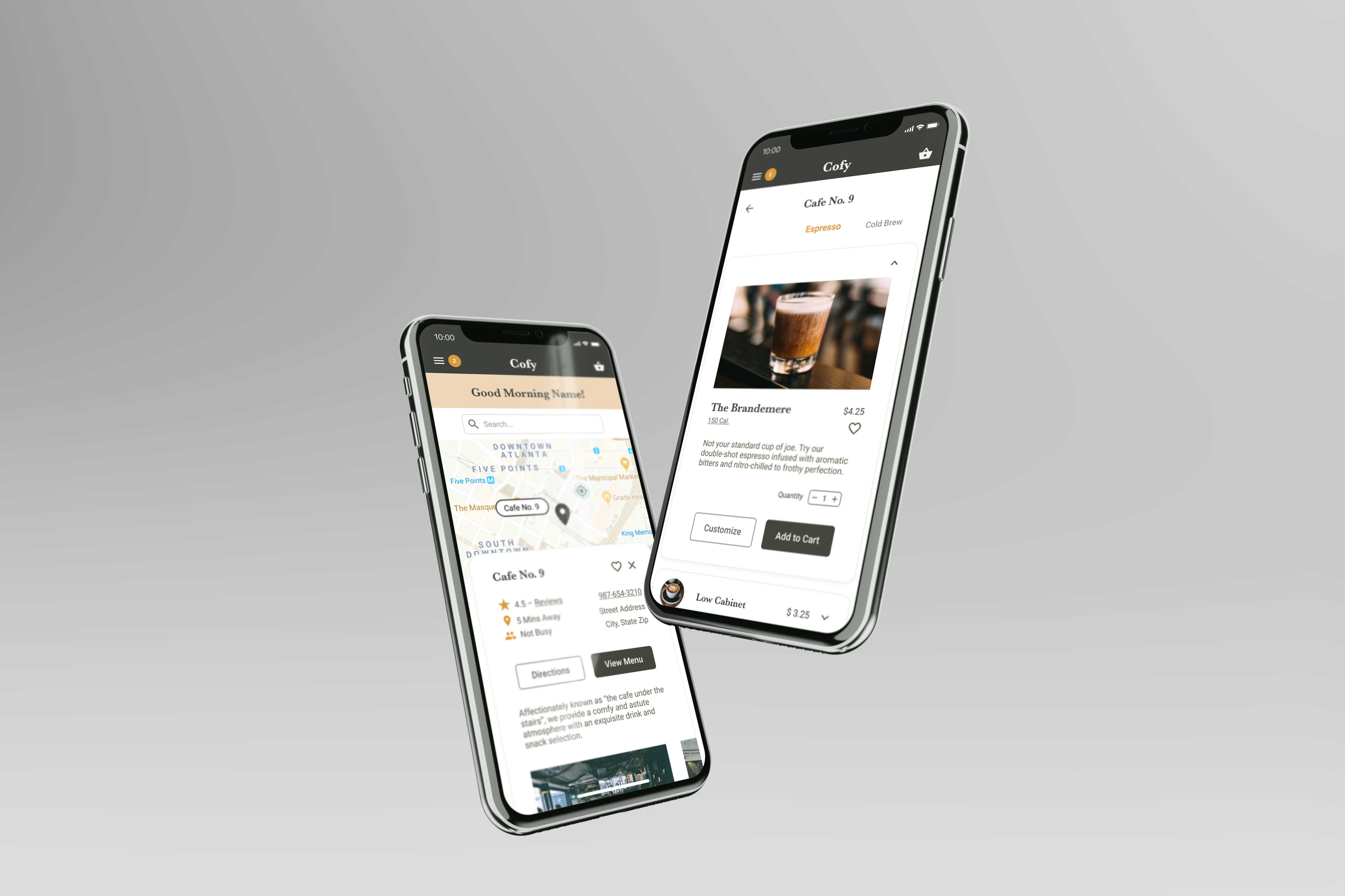
Solution:
The last iteration proved my hypothesis and increased the success rate of drink ordering. Placing important buttons in plain view removed any stop gaps in the design.
The final solution for the Cofy app can be viewed here:
https://www.figma.com/proto/JvEPlRwJxyzuDMS3Y7PPaD/Udacity-Cafe-Design-Iteration-4?node-id=158%3A1625&viewport=-5719%2C-58%2C0.6458781957626343&scaling=scale-down
Impact Overview
The last iteration proved my hypothesis and increased the success rate of drink ordering. Placing important buttons in plain view removed any stop gaps in the design.
The final solution for the Cofy app can be viewed here:
https://www.figma.com/proto/JvEPlRwJxyzuDMS3Y7PPaD/Udacity-Cafe-Design-Iteration-4?node-id=158%3A1625&viewport=-5719%2C-58%2C0.6458781957626343&scaling=scale-down